Timothy J. McElwee
email: tim@mcelweewebdesign.comPrint & Identity Design
-
Peabody Professional Institutes
 I
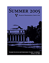
created graphics for the Peabody Professional Institutes' Summer 2005
offerings using an image of the most distinctive building on campus
with a bright purple—both commonly used in Peabody print pieces—to
provide a cohesive and visually interesting identity.
 -
LPO Ed.D. Brochure
 This is a simple brochure created for potential advisory board members
of the LPO
Ed.D. program. I focused on clear typography with punches of color
in the headings and tables.
 -
LPO End of Year Summary
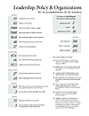 For the end of year summary, or "by the numbers," the numbers associated
with department accomplishments over the academic year became the
focus, as most faculty and staff were aware of these endeavors, but
not necessarily the number of people or dollars involved.
 -
AEFA Conference Abstracts
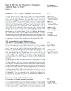 I
compiled the abstracts for the AEFA 2005 annual meeting to accompany
the official program, hence no cover page. I tried to focus attention
on the content of each presentation by placing descriptions and titles
in main, left column.
 -
IES Grant Proposal Cover
 This proposal cover posed a challenge to convey a focus on excellent
teaching while incorporating the logos of participating research institutions
and school districts. I tried to achieve this by using type and an
off-center photo to draw attention to the teacher while using the
negative space to group the institutions' logos.
 -
Breast Cancer Candle Tags
 These
tags accompanied candles, whose profits were donated to breast cancer
research.
 -
GD Graphics Library Icon Submission
 This is the application icon submitted for the GD
Graphics Library icon competition. It was designed to represent
GD library's flexible, server-side creation of graphics where elements
could be "pealed back" on the fly.
 -
Trailblazer Icon Submission
 This
was a submission into the Trailblazer
icon competition. It was meant to represent the programs intent of
leading users back to a website that they'd found on a previous search
without bookmarking and could no longer find.
Copyright © 2000-2008
Timothy J. McElwee and McElwee Web Design
Portfolio
Websites
-
Irish Connections
 A
design for my father's tour company to better showcase
tour features and photography taken on previous tours.
 -
Vanderbilt University
I created a style sheet based upon a Vanderbilt Creative Services design for the Vanderbilt University redesign that was live from August 2005 until August 2007.
-
School Choice Center
 I created the School Choice Center site to provide an
initial presence for this federally funded education
research center, with the intention that it will serve
as a hub for information dissemination to partner institutions
and the general public.
 -
Peabody Style Sheet Design
 I created a style sheet to enact a design from Vanderbilt Creative
Services and to provide maximum HTML control for the webmaster and
Peabody web team.. One style sheet controls all Peabody pages, including
design variations for departments and centers.
 -
Top Notch Hockey League
 This
is a partially completed design for an online hockey league using
NHL 2005 from EA Sports. Though timeline and budget changed, it features
a nice DHTML menu while fitting into the exitsting site structure.
 -
Peabody Journal of Education
 The
PJEwebsite
serves as journal's Vanderbilt web presence, providing abstracts for
each article and a means of accessing features from the publisher's
website for those who begin their search at Vanderbilt's website.
 -
LPO Ed.D. Program
 A
proposed design to provide a professional and attractive website for
the LPO
Ed.D. Program.
 -
Guthrie Gram—LPO Newsletter
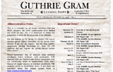 A
proposed design for the monthly e-mail message from the chair of the
department, trying to capture the feel of a late nineteenth or early
twentieth century letterpress posting.
 -
Peabody Center for Education Policy
 A
redesign and expantion, the Peabody Center website was created to
provide information about researchers, research projects, news updates,
and sponsored seminars.
 -
UNC CATIE Project
 CATIE's
site serves as an informational respository for potential patients,
their families, and researchers. Navigation and overall feel was improved
by separating the two major areas of the study with the colors of
the logo and tying them together on the homepage where the connection
made the most sense.
 -
UNC Schizophrenia Research Center
 The
Schizophrenia Research Center's site serves as the public face of
the research center and it's investigators. It was challenging to
reach a consensus about the design and symbolism, but the final outcome
is simple and unique.
 -
GVSU ARSP Division
 Here
I have created a site for a division which provides a great deal of
information and service to the campus. I've tried to maintain some
of the top-level layout and design elements within the program sites
in order to create a more unified experience. Some of the program
sites include the two sites below.
