Portfolio
Corporate Interactive
-
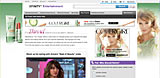
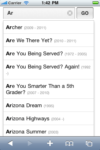
Comcast.net Mobile iSite
Design, XHTML, HTML5, CSS3, CSS, JS, jqTouch
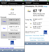
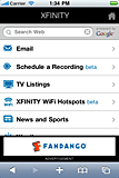

Here are a few views of our mobile site targeted at iOS and Android devices: mobile weather, mobile homepage, and the type-ahead-find feature in the mobile rdvr search webapp.
-
Comcast.net Search
Lead Developer, XHTML, CSS, JS, A/B Testing
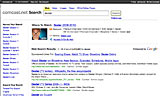
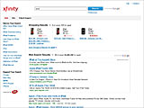
Here are the two primary search instances I supported as lead developer: search.comcast.net and search.xfinity.com. You can read a piece from engadget about the remote DVR features we added.
-
Comcast.net/Xfinity.com
XHTML, CSS, JS

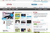
Here are a few visual examples of projects I've worked on for Comcast.net/Xfinity.com.
-
Wunderman Clients
HTML, CSS, JS, HTML Emails
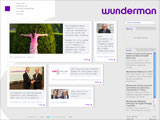
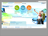
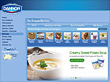
Above are samples of projects I worked on at Wunderman: (from left to right) Wunderman.com, Nationwide SmartRide, Start Here Go Places email campaign, and Dannon Kitchen Recipes
-
SelectMinds
Design, HTML, CSS, Flash component
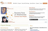
While I was working at SelectMinds, the company decided to update it's branding to better reflect it's place as a leader in the world of corporate social networking. I worked in conjunction with the Director of Product Management and the marketing team to create a clean and modern website design that matched the new branding initiative. (The link above goes to an Archive.org version of the site that is missing some of the sIFR headlines and flash elements.)

Freelance Interactive
-
Grace Community Church
HTML, CSS, JS
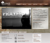
This was a quick chop and layout for a friend (and former co-worker). It was a great opportunity, with 50%+ of their user base on Chrome, to try out Modernizr to progressively enhance the experience with CSS3 gradients and other features.
-
Parent Resource Center
Design, HTML, CSS, JS
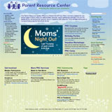
The Parent Resource Center website hadn't been visually updated in years. In 2009, I decided that they'd done enough for my kids that I ought to volunteer. I tried to keep it a little whimsical, but not too crazy with the website's primary audience being parents.
-
Management Analyses and Planning, Inc.
Design, HTML, CSS, Flash component customization
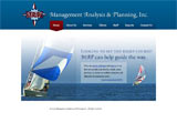
This is a great little site for my former employer's consulting company. Using the nautical theme and colors of their logo, I created a more modern visual framework for their important information. Now they have one of the best looking websites in their space.
-
FreeWorldU
Design, HTML, CSS
FreeWorldU is an online education site that with a goal to provide "free online education to everyone worldwide," using a flashcard model. I've worked with the development team to refine several areas of the site, from the flashcards to the administrative sections.
-
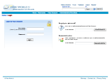
Working Papers
Design, HTML, CSS, JS
Working with a former colleague who'd gone back to graduate school, I created the Working Papers site with a clean, modern design to reflect the editors' initiative to revitalize the publication as an online journal. The design incorporates color elements from the larger University of Pennsylvania branding.
-
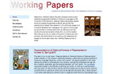
Irish Connections
Design, HTML, CSS, Flash integration
This is the internet presence for my father's tour company. He specializes in small-custom tours and wanted a site that reflected the more professional and experienced nature of his business. The primary goals of the redesign were to better showcase tour features and the beauty of Ireland. Luckily my dad's a pretty good photographer. I focused on incorporating large, colorful images to show potential tour guests exactly what they can see and do.
-
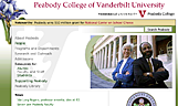
Vanderbilt University
CSS, HTML
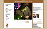
I created a style sheet based upon a Vanderbilt Creative Services design for the Vanderbilt University redesign that was live from August 2005 until August 2007. As part of their regular refresh cycle, the university webmasters wanted the site to use the latest development techniques. I'd just finished helping Peabody College create their first CSS-driven site, so they asked me along with other campus web professionals to assist.
-
School Choice Center
Design, HTML, CSS
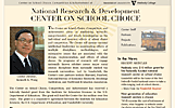
I created the School Choice Center site to provide an initial presence for this federally funded education research center, with the intention that it would serve as a hub for information dissemination to partner institutions and the general public.
I wanted to incorporate a sense of the long history of educational debate surrounding school choice. With the 50th anniversary of Brown vs. Board of Education near the founding of this center, I created a design that had the feel of a piece of school letterhead and newspaper articles of the 1950s.
-
Peabody Style Sheet Design
CSS
One of the primary goals of this project was to provide maximum HTML control for the webmaster and Peabody web team while allowing design variation for departments and centers. The result was one stylesheet that controlled all of the college's changing visual identities.
-
Top Notch Hockey League
Design, HTML, CSS
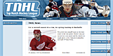
This is a partially completed design for an online hockey league using NHL 2005 from EA Sports. Though the project was ended by the client before completion, it features a nice DHTML menu while fitting into the exitsting site structure.
-
Peabody Journal of Education
Design, HTML, CSS, Photography
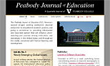
The PJE website serves as journal's Vanderbilt web presence, providing abstracts for each article and a means of accessing features from the publisher's website for those who begin their search at Vanderbilt's website.
-
LPOEd.D. Program
Design, HTML, CSS, Photography
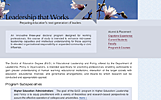
A proposed design to provide a professional and attractive website for the LPO Ed.D. Program.
-
Peabody Center for Education Policy
Design, HTML, CSS
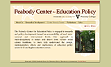
A redesign and expansion, the Peabody Center website was created to provide information about researchers, research projects, news updates, and sponsored seminars. The design incorporated leaf motiffs similar to Peabody College marketing materials that focused on the campus' status as an arboretum.
-
UNC CATIE Project
Design, HTML, CSS, Flash (site map)
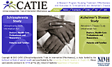
CATIE's site serves as an informational repository for potential patients, their families, and researchers. Navigation and overall feel was improved by separating the two major areas of the study with the colors of the logo and tying them together on the homepage where the connection made the most sense.
-
UNC Schizophrenia Research Center
Design, HTML, CSS, JS
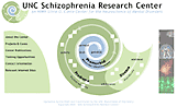
The Schizophrenia Research Center's site served as the public face of the research center and it's investigators. It was challenging to reach a consensus about the design and symbolism, but the final outcome is simple and unique with the progression of disease and research growing outward like a sea shell.
-
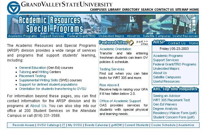
GVSU ARSP Division
Design, HTML, CSS, JS
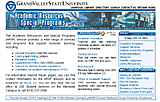
Here I have created a site for a division which provides a great deal of information and service to the campus. I've tried to maintain some of the top-level layout and design elements within the program sites in order to create a more unified experience. One of the program sites is included below.
-
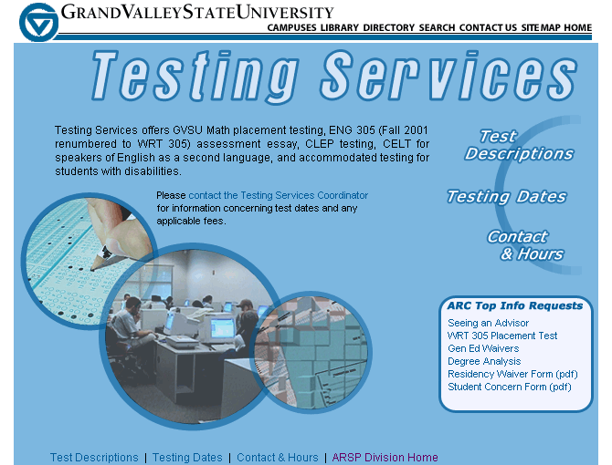
Testing Services
Design, HTML, CSS
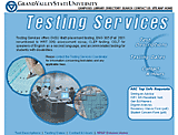
Testing Services coordinated a number of GVSU tests, including math and writing placement, CLEP, and English as a second language.
Print & Identity Design
-
Android Alliance of Philadelphia Logo Concepts
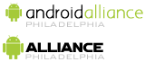
These are the top two options submitted for group approval to the Android Alliance of Philadelphia, a new user group getting started in Philly.
-
Working Papers Article PDFs
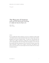
For the PDFs on the Working Papers site, I wanted to create a consistent structure and typography that would provide a more professional appearance. After all, it's created by Ph.D. candidates who aren't far from their degrees. I also created the template to allow for printing on standard letter sheets from a campus printer or for them to be eventually uploaded to a print-on-demand service for later collection or for a future revenue stream.
-
Peabody Professional Institutes
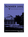
I created graphics for the Peabody Professional Institutes' Summer 2005 offerings using an image of the most distinctive building on campus with a bright purple—both commonly used in Peabody print pieces—to provide a cohesive and visually interesting identity.
-
AEFA Conference Abstracts
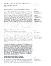
I compiled the abstracts for the AEFA 2005 annual meeting to accompany the official program, hence no cover page. I tried to focus attention on the content of each presentation by placing descriptions and titles in main, left column.
-
IES Grant Proposal Cover
This proposal cover posed a challenge to convey a focus on excellent teaching while incorporating the logos of participating research institutions and school districts. I tried to achieve this by using type and an off-center photo to draw attention to the teacher while using the negative space to group the institutions' logos.
-
GD Graphics Library Icon Submission

This is the application icon submitted for the GD Graphics Library icon competition. It was designed to represent GD library's flexible, server-side creation of graphics where elements could be "pealed back" on the fly.
-
Trailblazer Icon Submission

This was a submission into the Trailblazer icon competition. It was meant to represent the programs intent of leading users back to a website that they'd found on a previous search without bookmarking and could no longer find.


About
I'm Tim McElwee. I'm originally from Allegan in Western Michigan. I've been a developer/designer since 2000.
In August of 2015, I transferred within ADP to AdvancedMD in South Jordan, Utah. I've been working to help revamp the look and feel of AdvancedMDs practice management and electronic health records applications. I've been building proofs of concept in AngularJS to ascertain viability of UX ideas. I've also been acting as a central resource for managing common SCSS/CSS libraries used across the organization.
At the end of 2013 until the middle of 2015, I moved over to ADP's freshly opened Innovation Lab. We're trying to make your HR systems experience suck less. I'm on the Creative Technology team that works within the organization to explore new technologies and prototype new ideas ahead of production implementations.
I spent 2013 working for Whosay, a celebrity social networking service. I learned all about modern Javascript-driven development, visited beautiful Albany on a regular basis, and got to meet some famous folks.
From 2011–2012, I moved back to New York for a second tour with SelectMinds, as the Senior UX Developer, adding new features to the CommunityConnect social networking product, like mobile optimized pages, and refining existing features to take advantage of user friendly techniques like AJAX loading and message sending.
From 2009–2011, I worked at Comcast Interactive Media in Philadelphia. I worked on Comcast.net, Xfinity.com, and XfinityTV.com. That includes general front-end duties and getting to work with our search instances and our mobile sites.
From 2005–2009, I worked in New York City as an interface engineer for Wunderman and as a web developer at SelectMinds. Both were a great introduction to different aspects of major league web design. At Wunderman, I learned how to crank work out in an advertising shop. At SelectMinds, I got to focus on our software-as-service social networking product servicing Fortune 500 clients.
Before New York, I worked at the Peabody Center for Education Policy. It's an educational research center at Peabody College of Vanderbilt Univesity, in Nashville, Tennessee. While there, I had the luck to work with both the college and university to create their first CSS-driven websites.
All of this web focus started while I was an undergrad at GVSU. I worked with learning and physically impaired students as a book reader/scanner and as the assistive technology trainer, teaching students about the assistive software packages available through the disabilities services office. I really enjoyed being able to show people how to use a piece of software that could make their daily life easier. Those experience led to accessibility research when the division needed a new website. I discovered the web standards community through that research and I've been on this journey ever since.
Photos